Elementor page-builder is a great tool for quickly creating custom layouts that can be easily edited. The pro version of the plugin has a wide variety of widgets, but sometimes you still need to create a custom widget for a specific purpose. There are some great tutorials that cover the basics of building a custom Elementor widget.
This article focuses on how to add a Styles tab and controls to your custom widget.
Where To Add Code For Style Controls
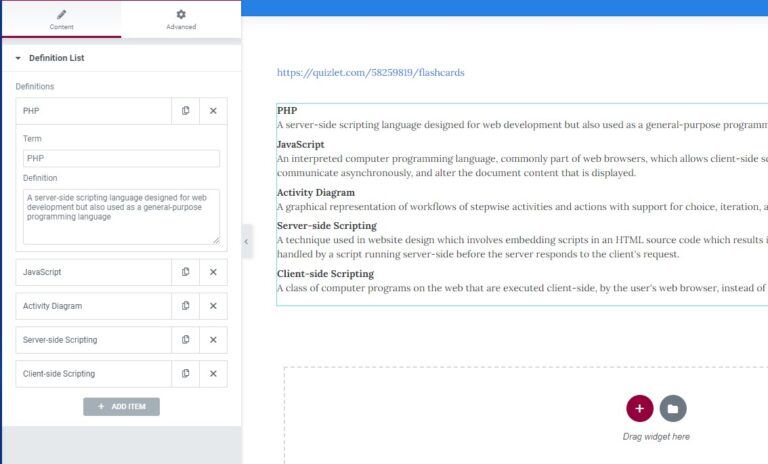
As an example, I’ll build a simple widget that adds a definition list to the page. Below is the code used to extend the Elementor\Widget_Base class and create a new class named Definition_List_Widget.
All of the code for this tutorial will be added in the register_controls method, shown near the bottom of the code below. Right now it only contains calls to add content controls. The definition list widget uses a repeater control with a text field for the term and textarea for the definition.
In order to use Elementor controls in a custom widget, we have to import some of the classes from the plugin. At the top of our code, before declaring the custom widget class, we’ll need to import the Elementor\Controls_Manager class:
use Elementor\Controls_Manager;
    use Elementor\Controls_Manager;

    final class Definition_List_Widget extends \Elementor\Widget_Base {

        public function __construct( $data=[], $args=null ){
            parent::__construct( $data, $args );
            wp_register_style( 'demo-elementor-widget-css', plugin_dir_url( __FILE__ ) . '/assets/css/demo-elementor-widget.css' );

            wp_register_script( 'demo-elementor-widget-js',  plugin_dir_url( __FILE__ ) . '/assets/js/demo-elementor-widget.js', ['elementor-frontend'],'1.0.0', true );

        }

        // Get widget name
        public function get_name() {

            return 'definition-list-widget';

        }


        // Get widget title
        public function get_title(){

            return __( 'Definition List Widget', 'definition-list-widget' );

        }


        // Get icon for widget title
        public function get_icon(){

            return 'fas fa-list';

        }


        public function get_categories() {

            return [ 'general' ];

        }

        public function get_script_depends(){

            return [ 'demo-elementor-widget-js' ];

        }


        public function get_style_depends(){

            return [ 'demo-elementor-widget-css' ];

        }


        protected function register_controls() {

            $this->start_controls_section(
                'definition_list_section',
                [
                    'label' => __( 'Definition List', 'ecr-elementor-circle-slider-extension' ),
                    'tab'   => \Elementor\Controls_Manager::TAB_CONTENT,
                ]

            );

            $repeater = new \Elementor\Repeater();

            $repeater->add_control(
                'repeater_term',
                [
                    'label'         => __('Term', 'demo-elementor-widget' ),
                    'type'          => \Elementor\Controls_Manager::TEXT,
                    'default'       => __( 'Term', 'demo-elementor-widget' ),
                    'label_block'   => true,
                ]
            );


            $repeater->add_control(
                'repeater_definition',
                [
                    'label' => __( 'Definition', 'demo-elementor-widget' ),
                    'type' => \Elementor\Controls_Manager::TEXTAREA,
                    'default' => __( '', 'Demo Elementor Widget' ),
                    'placeholder' => __( 'Input definition here', 'demo-elementor-widget' ),
                ]
            );

            $this->add_control(
                'definition_list',
                [
                    'label' => __( 'Definitions', 'demo-elementor-widget' ),
                    'type' => \Elementor\Controls_Manager::REPEATER,
                    'fields' => $repeater->get_controls(),
                    'default' => [
                        [
                          'repeater_term' => __( 'Term', 'demo-elementor-widget' ),
                          'repeater_definition' => __( 'New Definition', 'demo-elementor-widget' ),
                        ],
                        [
                          'repeater_term' => __( 'Term', 'demo-elementor-widget' ),
                          'repeater_definition' => __( 'New Definition', 'demo-elementor-widget' ),
                        ],
                ],
                'title_field' => '{{{ repeater_term }}}',
                ]
            );

            $this->end_controls_section();

        }

        protected function render(){

        }

        protected function _content_template(){

        }


    }
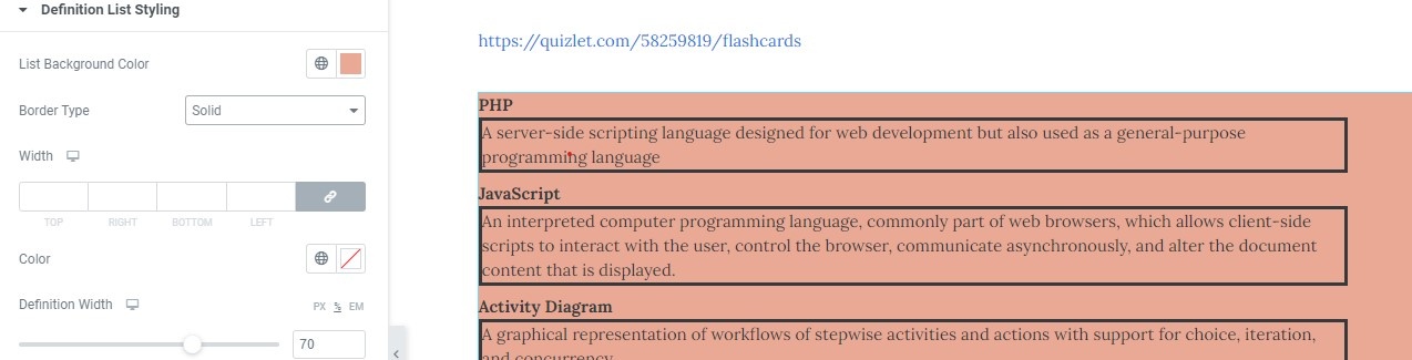
For this example, I borrowed web development terms from flash cards created by Quizlet user ‘brianbaho’.
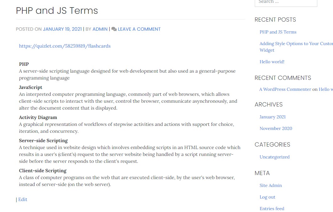
Looking at the page with the definition list on the front end of the site, it’s formatted as expected but not very exciting to look at.
Adding style options to the editor will allow the user to easily add background-color, borders, and other styles to make it more engaging.
Code the Style Tab
The first thing we need to do is add the Style tab to the widget editor pane. To do this we use the same function call as for the Content tab, but change the tab parameter so it registers it as a style tab rather than a content tab. After this I’ll add the $this->end_controls_section call also. As I start to add controls in the next step, I’ll make sure to put them before that function call.
$this->start_controls_section(
'definition_list_styles',
[
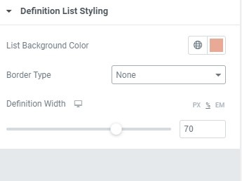
'label' => __( 'Definition List Styling', 'demo-elementor-widget' ),
'tab' => \Elementor\Controls_Manager::TAB_STYLE,
]
);
// Controls go here
$this->end_controls_section();
Add A Background Color Input
The first control will set the background-color of the list.
Below the $this->start_controls_section added in the last step, I’ll add $this->add_control(). I’ll use the following parameters to configure this function:
- name: The name of the control. This will also be the key when data from it is saved to the database.
- label: The text that will display above the input.
- type: What type of Elementor control to put in the style tab. For this one, we’ll use the COLOR control.
- selectors: The html elements to apply the style to.
Here’s the code for that:
$this->add_control(

    'definition_list_bgcolor'       => __( 'List Background Color', 'demo-elementor-widget' ),
    'type'                          => \Elementor\Controls_Manager::COLOR,
    'selector'     => [
                    '{{WRAPPER}}'       => 'background-color: {{VALUE}}'
    ]
);
The selectors parameter sets which part of the widget to apply the resulting css.
The key/keys in the selectors parameter are the css selectors, and the values are the css declarations. To apply the style to the widget element, which is to say the wrapper for the widget, use the tag {{WRAPPER}} as the key. If you want to only apply the style to a specific part of the widget and not just the wrapper as a whole, you’ll need to add child selectors to target that.
For the declaration, you’ll add the property and the value separated by a semi-colon. For many controls you just use {{VALUE}} to pull in the selected value.
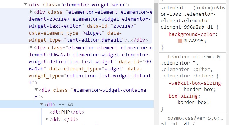
To only apply the css rule to the dl element and not the entire widget, add the tag dl so it targets the definition list element.
    'selectors'     => [
        '{{WRAPPER}} dl'        => 'background-color:{{VALUE}}'
        ]
When I examine how the css is being applied in Chrome dev tools, I see that it’s now targeting the dl element instead of the widget element.
You can find more information on the color control in the Elementor documentation.
Responsive Controls
For css that needs to change for different screen sizes, you can use $this->add_responsive_control() instead.
When you use this type of control, the icon for screen size appears next to the input label. This will allow the user to set the value for mobile, tablet, and desktop separately.
For controls that set the size of an element, you have the option to use different units. In the code below, there is a size_units parameter that takes an array of different units. Here the size units set are px, %, and em. The range parameter is where the minimum and maximum values, along with the step value, are set. Most sliders in Elementor use 1 as the value for step, but if you feel that the slider would work better in increments of 5 or 10 you can set it to whatever value you wish.
Since this is a responsive control, default values can be set for different screen sizes. You’re not confined to use the same unit either —each value can use a different unit of measurement if needed.
Using the {{VALUE}} placeholder in the selector parameter for this type of control won’t return a value. Because the input returns both the number value and a size unit, you’ll need to use {{SIZE}}{{UNIT}} as shown in the code below.
    $this->add_responsive_control(
          'definition_width',
          [
            'label'             => __( 'Definition Width', 'demo-elementor-widget' ),
            'type'              => Controls_Manager::SLIDER,
            'size_units'        => [ 'px', '%', 'em' ],
            'range'			=> [
                'px'	=> [
                    'min'	=> 100,
                    'max'	=> 1000,
                    'step'	=> 10,
                ],
                '%'     => [
                    'min'       => 10,
                    'max'       => 100,
                    'step'      => 1,
                ],
                'em'	=> [
                    'min'	=> 2,
                    'max'	=> 50,
                    'step'      => 1,
              ],
            ],
            'devices'   => [ 'desktop','tablet', 'mobile' ],
            ],
            'desktop_default'	=> [
              'unit'	=> '%',
              'size'	=> '80',
            ],
            'tablet_default'    => [
              'unit'    => '%',
              'size'    => '90',
            ],
            [
              'mobile_default'  => [
                'unit'  => 'px',
                'size'  => '300'
              ]
            ]
            'selector'	        => [
              '{{WRAPPER}} dl dd' => 'width:{{SIZE}}{{UNIT}}',
            ]
          ]
      );
Group Controls
- name
- label
- selector
The Elementor developer documentation has a list of available controls that can be used here: https://developers.elementor.com/elementor-controls/. To see exactly how the default widgets are set up, you can find the code for built-in widget in this location in the Elementor plugin: /elementor/includes/widgets/.